This was created for my graphics class in the S.I. Newhouse School of Public Communications at Syracuse University.
Isaac Newton was a revolutionary scientist and mathematician that changed the way humans think about the world and rede ned the limits of the planet. While researching Newton, the most powerful imagery I could think of was an apple. This comes from his law of gravity, formed after an apple fell on his head. His theory became the foundation upon which future generations built to create greater understandings about the Earth.
Newton created a legacy, and it all seemingly can be traced back to an apple and a tree. The idea of an apple is not only relative to Newton, but biblical as well. A well-known story in the bible is that of Adam and Eve and the forbidden fruit. The apple played a role in starting the relationship between God and humans, similar to how the apple and Newton rethought the relationship between the planet and humans.
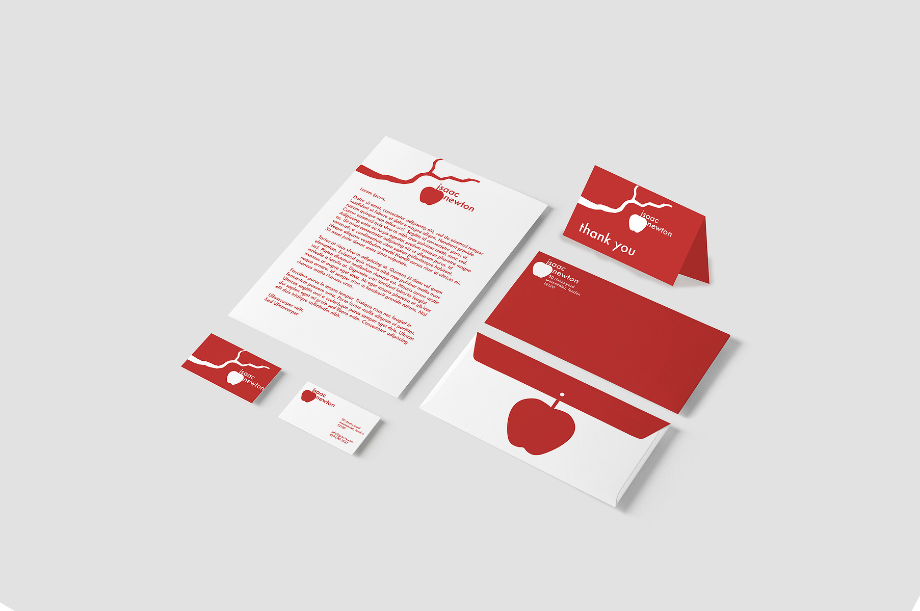
I tried to work this concept into the logo, and wanted to make it focused solely on the apple rather than the idea of it hitting Newton on the head and sparking the idea. That moment when the apple fell from the tree is an ephemeral and abstract action that I wanted to capture. I wanted my logo to feel like the apple was in motion, just having left the grip of the tree’s branch. When I think of mathematicians and physicists, I think of perfection and meticulousness, so I wanted to make my logo something clean with a slight bit of complexity and cleverness. This matched my personal style as well, and I was able to work in a form of modern- ism to the work, which t well considering how relevant Newton’s theories still are today.
I chose to create the apple falling out of the tree with a small dot above the stem, which looks like the letter “i”. This holds the purpose of being the first letter of Newton’s name, but also shows the motion of the apple falling with the dot there as a drag. I stuck with a simple color scheme of white and red (C: 18%, M: 93%, Y: 90%, K: 7%). Red is a color that is bold and energetic. Red is associated with intensity and power, similar to the groundbreaking concept of gravity. White is a color about perfection and light tying into the design style and modernism concept.
The typeface I chose to use is Futura in the font style medium. The size varied throughout my logo use, depending on where it was placed, but on the main logo it is size 40pt. The tracking for Newton’s name is -2pt on both first and last name. The tracking remained the same throughout all of my branded pieces. I wanted to keep a consistent and identity able look. Throughout the stationary set, I wanted to make sure I always kept the apple with the “i” worked into the stem. This image was the most unique and identifiable, the tree was there for extra decoration and added interest. I carried this and the constant two colors through my work to create a distinct theme unique to Newton.
I took the time to not only understand Newton as a person, but to think about how his discovery of gravity reimagined the world and how that has carried through to present day. I took my time with the logo and tried multiple drafts to get the perfect results and paid close attention to detail to get everything exactly to my liking. I believe that the subtle focus capturing math and physics shows my clear understanding of the subject matter and how important it is to express these key elements in the logo. I’m extremely proud of what I have produced and have learned a lot from my first branding project. I now know the importance of taking your time to try out different looks and methods while making sure to keep all ideas. The logo I chose was not my first or last idea, but rather one in the mix of all of them that later stood out to me. I had a really great time doing this project and loved being able to create an image for such an incredible man who changed our world.